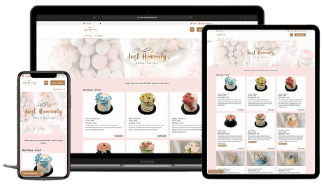
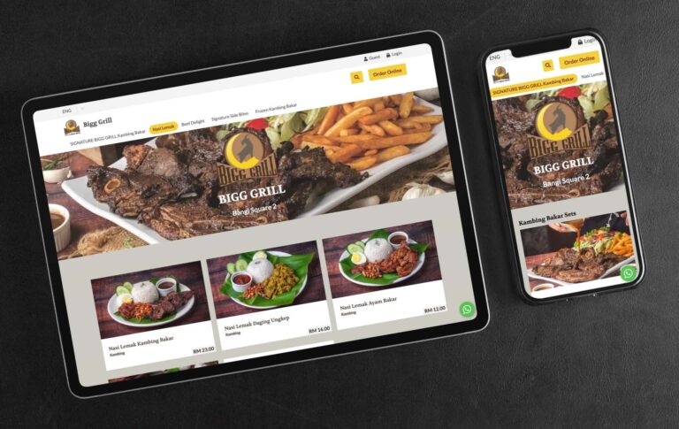
What Are Responsive Websites?

Responsive websites are sites that respond to the size of the device it is being viewed on. This can be a laptop, desktop computer, tablet, or smartphone. You can lose customers when a bad shopping experience is presented. Conversely, you can grow sales with responsive websites as a responsive website will change the layout, text size, and images to fit the screen size of the device it is being viewed on. In a nutshell, you want to present the best possible shopping experience that keeps a visitor shopping and compels them to act.
Having a responsive website design is important because visitors are viewing websites on all different types of devices. The last thing any restauranteur wants to see is when a customer has to scroll left and right and zooming in and out to see all the content
It’s no secret that a good user experience (UX) is essential for any website or app. After all, if users don’t enjoy using an ordering platform, they’re not going to stick around for long.
That’s why we made it critical that our FoodVillage ordering platform is responsive and looks great on all devices, from phones and tablets to laptops and PCs. In this article, we’ll discuss how you can grow sales with responsive websites. We will also throw in some tips for creating a great user experience.
1. Optimised User Experience
Your customers shouldn’t have to work so hard to shop on your web store. Here are some ways you can stop losing customers if they have a bad user experience when a website is not responsive:
It’s easy to find the food they are looking for
Hungry customers can be ‘hangry’ and impatient and if they have to go through an obstacle course shopping experience to simply look or select what they want, they’re going to drop off your store very quickly. You only get one chance to leave a first impression.
Never present a mobile user experience on tablets and desktop devices
Even though 62% of Malaysians in 2021 use their mobile phones to shop, don’t miss out on the 38% who still use tablets and desktops/laptops to shop online. Reason? You can still view more information at one time on a larger screen than on a mobile platform.
Only about 25% of a desktop screen is occupied if a mobile experience is presented on it.
Constant scrolling up and down to view all products
Scrolling up and down through a menu should be reduced as much as possible, especially on a tablet and desktop platform. A responsive website reduces this significantly, from displaying 1 product per row to 2 or 3 in a row.
2. Engaging & Captivating Product Images
In the online world, the only way a visitor can ‘taste’ your food is with their eyes. Until technology is able to catch up to transfer the sense of smell and taste digitally, the only means to convert visitors to customers is through their eyes. Here’s how you can achieve this:
Invest in stunning food photography
A picture does paint a thousand words. The key to conversions is when a customer exchanges money for value. When you are able to increase the perceived value of a given product, customers will have no hesitation to buy from you. We are not condoning the use of trickery, all we are saying is that your food images should look as good as it tastes.
Compelling food photography is truly an investment, as one product photo will continually sell for you for months or years. Conversely, having bad photos could be the very reason why you are not enjoying the sales you would like to have.
Images are large and have a high resolution
Ever tried buying a product when the images are the size of a small app icon on your phone? So small in fact, you don’t really know what you’re getting. Even worse when all you see is a catalogue of small images of food.
Conversely, visit any fast food restaurant’s web store and you’ll notice one thing, food images are sharp, large and even mouth-watering. This is the reason why we provide the option for our clients to present sufficiently large food images on our food ordering platform and on a mobile, the size is from edge to edge.


